Canon EOS 550D/650D - Photography and Filming The Canon 550D is highly advanced from it's previous predecessor 450D by filming in full HD it immediately raises the bar on all over competitors for it's time. Therefore, even other SLR cameras aren't you using a better HD resolution than the 550D plus not being restricted to standard. To previous cameras, the 550D in all areas has been evolved, the ISO settings, the mega pixels on the camera and higher Digic processor which involves smooth & natural looking colours, split second image review and start up times in addition, it's a faster more present processor making the camera very fast. Another benefit of the 550D, you don't need anymore tapes. All the footage are saved on to an SD card included in an extra package or buy in local stores for a cheaper price than tapes. However another function it has is a stereo external microphone to enable you to record a perfect sound and quality with the 3.5mm stereo jack socket. The disadvantages of the 550D is the built in internal mic records poor quality sounds but with the use of jack socket that can soon be overcome. Also you can only film for a specific amount of time before the camera overheats and finally HD files are a huge capacity so make sure you have many more on demand. I used this for pictures leading up to the final flyer.. | 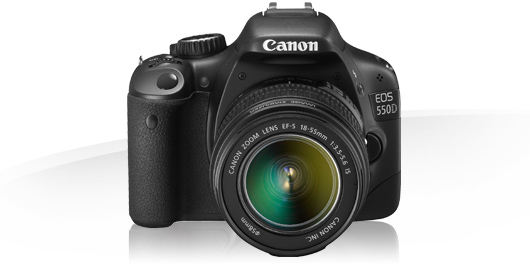 |
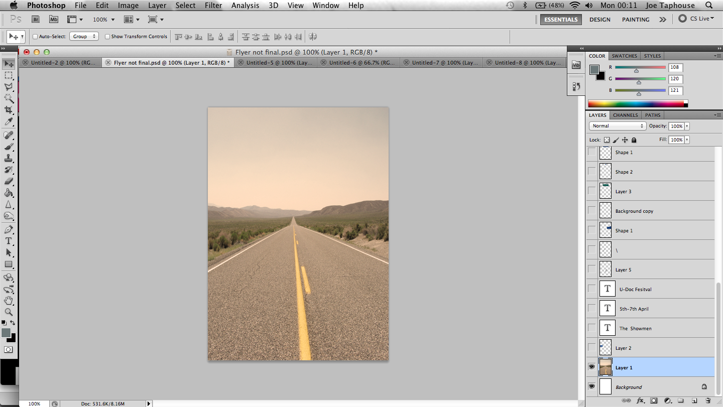
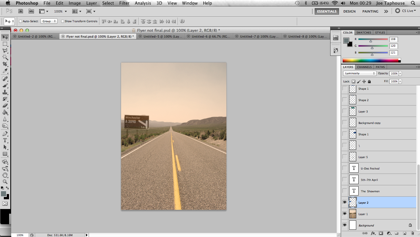
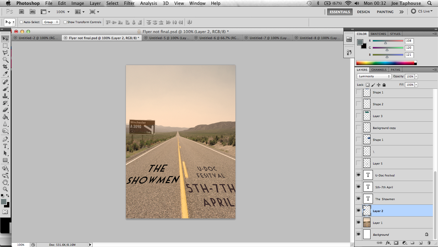
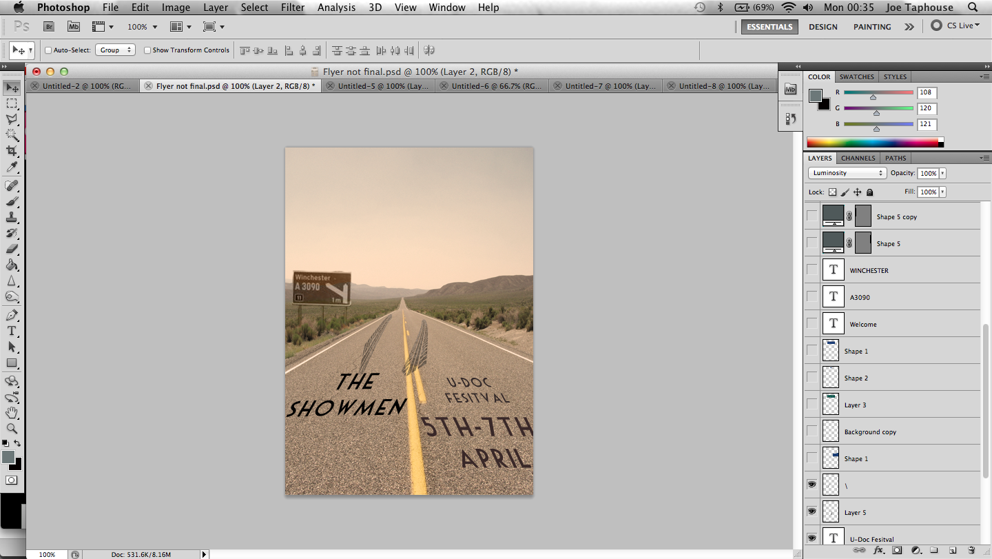
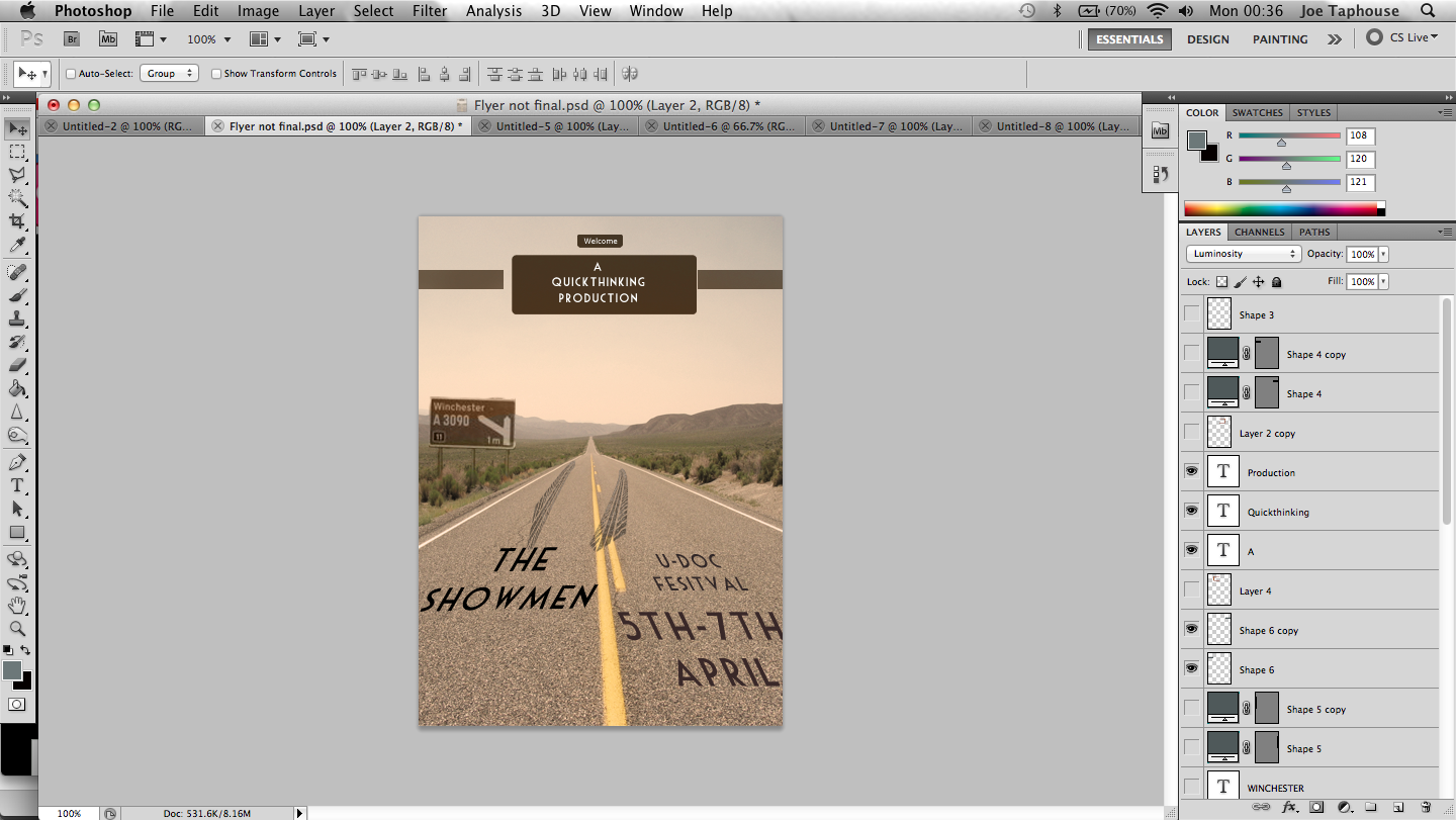
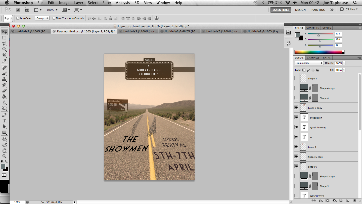
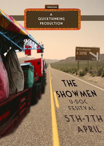
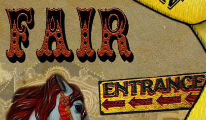
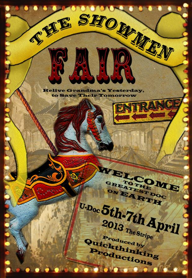
Creating the flyer for one of our promotion products To create the flyer, I research into the different sizes to produce them on Photoshop, I made a few flyers with the multiple sizes. However before creating the style of the flyer I had to be aware of the competitors and how related production use and make their flyers for advertising. I started with the size to be a width of 12.7cm with a height of 17.28cm as I didn't want it to be huge like our propaganda poster even though there slightly similar in a way. I tried to make it seem to intertwine with the style and subject of our documentary (following travellers/Steam fair folk) with the open road but editing the colours throughout the image making it brown/rusty symbolising the dying trade of the business. 1) Firstly, I choose the image of an open motorway to attribute the job travellers have to undertake being on the road all the time but used a layer option to change it to more of a brownish feel to show the deterioration. 2) Next, I added another image of an motorway sign with the similar colour brown but showing where we'll be unleashing the documentary at U-Doc festival next year more to advertise our whereabouts if any people want to attend. 3/4) After, I added the text down the bottom describing the project and where it will be shown. Using the text tool with the text style 'Mouse Deco' from www.dafont.com, I then used the free transform tool with the use of skew and shaped the text to seem it was struck to the road. Plus importing vehicle marks on the road fleeing from the title of the project to add to the point of travellers. 5/6) Then I used the shape tool to look like motorway signs overhead showing our production company with the lights around the sign to show the steam fair background with the image. Keeping the same brownish tone throughout the flyer gives it good color coordination. Overall the tools I used were very basic, the majority of the tools or effects were used to categorise the color in all the separate images showing the difficulties running a steam fair business. I used transform, skew, layer options, magic wand, shape tool, text tool and fill etc. The pictures will be linked below. By Joe Taphouse |
After we had a group meeting, we came up with a conclusion on the poster and flyer, they had to converge somehow. So i edited the truck in the picture by adding the color to it, advantage of this is that the convergence between both poster and flyer were working.
Creating the poster as one of our promotion products
To create our promotional documentary poster I used Photoshop.
To create our promotional documentary poster I used Photoshop. Photoshop is a great program to not only to edit raw images but also to combine graphics and imagery together like I plan on doing during the editing of the poster.  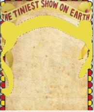 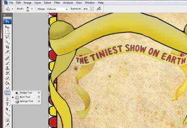 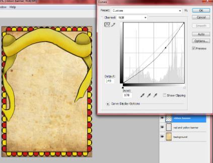  |  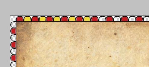 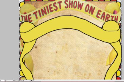 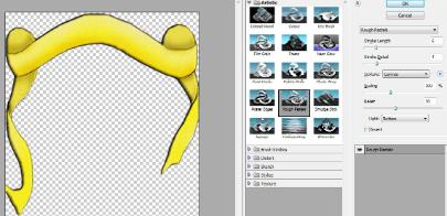 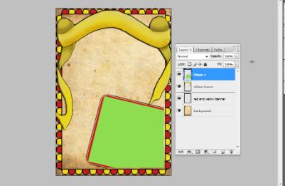  |
First Draft of Poster
Below are the print screens of the changes I did on the poster after me and my group deciding that in needs to look a bit more old fashioned and worn out by darkening the colours a little bit.
 |  |
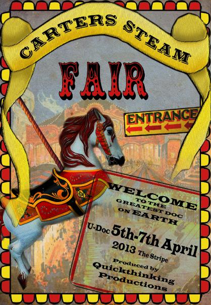
FINAL POSTER
Creating the Trailer
1. Capturing the photos and audio
We as the team travelled to Maidenhead and went to the 'Carter's Steam Fair' yard where they stay and work while they are not on the road. We were freely allowed to take photos around the yard before hand using the Canon 650D. After that, using the marantz and mic, we recorded the interview with the son of the owner. This all went extremely well and it definitely helped build a relationship between us and them so it would be more comfortable when making the documentary.
2. Structure
As the editor of the documentary, I was given the task to put the trailer together as part of our promotion. Before anything, I thought that deciding on the structure of the trailer would be the best way to start. I had a vision that it would start with a piece of audio that introduces the documentary partnered with a photo of the main subject. The music would then start (preferably a piano driven piece) with 'Quickthinking Productions' appear then audio of how he started out. This would then continue with shots of the Carter's yard then the text 'Carter's Steam Fair-Established 1975' would appear and maybe then include a piece of audio about the prices of the fair or stereotyping and how tough it is. Then the text 'Carter's Steam Fair-Struggling To Survive' which would obviously link to the audio. This would continue when eventually the text 'Carter's Steam Fair-Keeping History Alive' appears as the pace would quicken with different photos as the final bit of text 'Carter's Steam Fair-Is the End Near?'. The final bit of audio from the interview would be a line that would sum it all up with the title coming up. I checked this structure with the director and producer and they were both happy with it.
3. Choosing photos and audio clips
We took about 200 photographs altogether and we managed to narrow it down to about 30 pictures that we wanted to use in the trailer. I listened through the interview which lasted about 15 minutes and picked out different clips that summed up the main points I wanted to make in the trailer. Again, I ran this by with the director and producer and they were both happy with what was chosen. We then edited the photos in Adobe Photoshop and the audio in Adobe Audition so that they were both ready and in good quality for the trailer.
4. Editing the Trailer
Joe (sound) managed to find a piano driven piece of music that was perfect for the trailer because it had slow moments and bits where the pace quickens. With the structure in mind, I edited the piece and made the beginning with no music. Just a shot of the subject with a simple clip that introduces the documentary. I stuck to the structure pretty well and I thought that editing the photos with the music would work well. So when the pace of the music quickened, the cuts of the photographs did as well and this is the same with slow parts of the music. I also thought that it would be very important to link the photographs with the audio so when the subject speaks about sign writing then I put in pictures of signs. When he talked about living in a wagon, I put it in a picture of a wagon. These are obvious literal things but I did use it in metaphorical means as well such as when he talks about hoping the Carter's will continue and die out as it is tough with a picture of a wheel barrow rusting. This shows that the Carter's is rusting away and creates empathy with the audience. It is all about putting things into context when it comes to pacing and linking things together.
After the whole structure had been put together, the only other thing that was lacking was some movement in the pictures to add even more empathy towards the audience. I did not want to have movement with all the photos because it would look too weird and not a lot of would have any context. I had the director and producer look through the trailer firstly to see if they were happy with it which they were and then Daniel (producer) and myself looked through the trailer and determined what shots should have movement and what that movement should be. I then created the movement to a few selected photos which really helped add that special effect to the trailer and I really think that it will persuade the audience to watch the final documentary.
By Dale Stewart.
Social Networking Sites
These are all working examples of our social networking sites, as well as video hosting sites. They all converge very well, following the same aesthetic themes as each other to form a strong recognisable image. We will be using these to gain a wider audience, spreading the word about the documentary and slowly building hype up to UDOC. We will be using the social networking sites to gain more fans as well as give them a more behind the scenes access. The video hosting sites Youtube & Vimeo are being used to show the trailer and try to gain a wider audience and fan base as well as get people to come and watch our film next summer.
This is our Twitter Page below. 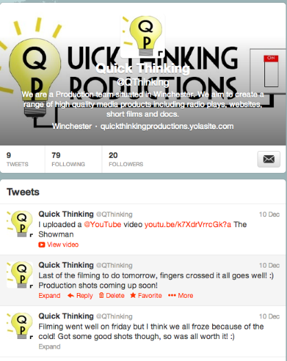 This is our Youtube channel below. 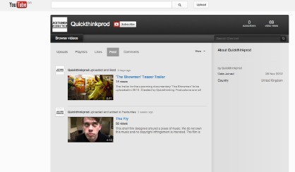 | This is our Facebook page below. 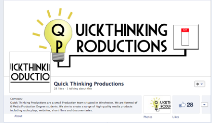 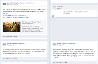 This is our Vimeo channel below. By Zara Kirkpatrick |